MyMedicalJournal
Context
Problem
Goal
MyMedicalJournal was our project for the Master's in HCI Interaction Design course. This project was completed in five milestones, followed by a set of usability tests.
Many people find managing the many facets of their health to be difficult and overwhelming.
Develop MyMedicalJournal, a one-stop application to manage appointments, prescriptions, and family health.
Milestone 1
Establish Requirements
The first Milestone for MyMedicalJournal will establish the focus of the HCIN 620 project. We will discuss the problem, our solution, and the stakeholders.
THE PROBLEM
Many people will use a physical planner, the calendar app, the reminders app, or an alarm app when they want to remember previous medical appointments, future appointments, prescriptions they are currently taking, time and day of those specific prescriptions, prescription refills, and/or treatment or care summaries.
This practice may become unorganized and overwhelming for users.

OUR SOLUTION
Develop an application that allows its users to keep track of appointments, medications, and their medical histories.
This one-stop shop application will allow users to track, see long term trends, and take control of their own healthcare.
Milestone 2
Contextual Inquiry & Interviews
In the second Milestone for MyMedicalJournal, we conduct interviews to collect data, carry out an interpretation session, and create affinity diagrams to analyze our data.
Contextual Inquiry Process
1. Preparation:
-
Discuss, pilot, and adjust the interview questions
2. Interviews:
-
Conduct interviews based on prepared questions
-
Ask questions based on the participant’s responses
-
Keep the interview open-ended
3. Interpretation:
-
Evaluate themes
-
Complete the affinity diagram
-
Categorize the data from interviews

After completing the contextual inquiry process, we were able to collect three final top-level labels:
-
I want my expectations fulfilled (Figure 1)
-
I want efficient productivity (Figure 2)
-
I want external consistency (Figure 3)

Figure 1: I want my expectations fulfilled

Figure 2: I want efficient productivity


This affinity diagram displays the first, second, and third level labels from our contextual inquiry process.
The Interviews
We designed our interview questions on the following aspects: demographics, user habits, current issues, family information sharing, and user expectations.
The interviews were conducted one-on-one. Each interview lasted about 20-30 minutes. 10 participants with various ages, occupations, and medical situations were interviewed. They provided multiple levels of user information for our user research.
Interpretation
The process of creating our affinity diagram had us to evaluate the different themes and sub themes that emerged from all of our interviews. We saw current statements about current needs, habits, and issues. Ultimately, we will use these themes to continue our process of designing the MyMedicalJournal application.
Milestone 3
Personas

In the third Milestone for MyMedicalJournal, we created personas for our project.
Behavior Pattern 1:
Goes to all preventative care appointments every year, places importance on keeping track of vitals to remain healthy, remembers to schedule appointments months in advance, is very tech-savvy, keeps track of health records, and uses smartphone apps like reminders and calendar to stay informed about their own health.
Behavior Pattern 2:
Goes to most preventative care appointments and additional appointments when necessary, needs to remember to take and refill prescriptions, knows how to operate a smartphone, and mostly relies on non-digital means of organizing health records, like planners.
Behavior Pattern 3:
Only goes to medical appointments when they have an issue, stashes documents from doctors in purses/wallets and often loses track of them, uses a smartphone for everything, and has an “I’ll remember it” mentality.
Primary Persona

Secondary Personas


Anti-Persona

Lessons Learned
This process to help create our personas gave us these takeaways:
-
It kept our personified users focused on and derived from research and qualitative data
-
It helped us clarify unmet user needs
-
It reinforced our product’s focus
Milestone 4
Low-Fidelity Prototype
In the fourth Milestone for MyMedicalJournal, we created the Low-Fidelity Prototype for our project.
Task Flow
To create our task flow and decide on the navigation of our app, we first hopped onto a call to discuss how a user would navigate through our application.
We decided we would create four primary task flows for our app: onboarding, appointments, prescriptions, family health, and account settings/help. The task flow diagram can be seen below:


Lo-Fi Prototype
After creating our task flow map, we continued to create the low-fi prototypes for the four primary task flows: onboarding, appointments, prescriptions, and family health. The low-fi prototypes for each task can be viewed below.
Note: the prototypes can be viewed in a pop-up if clicked.


Milestone 5
High-Fidelity Prototype

In the fifth and final Milestone for MyMedicalJournal, we created the High-Fidelity Prototype for our project.
Creating Design Standards
The first thing we did was establish our design standards. We used coolors.co to create a color scheme that we would follow, then designed primary, secondary, and tertiary buttons and chose the typography styles for the headings and subheadings.
We also put together the bottom menu bar, with links to Home, Appointments, Prescriptions, and Family.

Hi-Fi Prototype
After creating our design standards, we started building out the high-fidelity screens for each task using the respective low-fidelity wireframes.
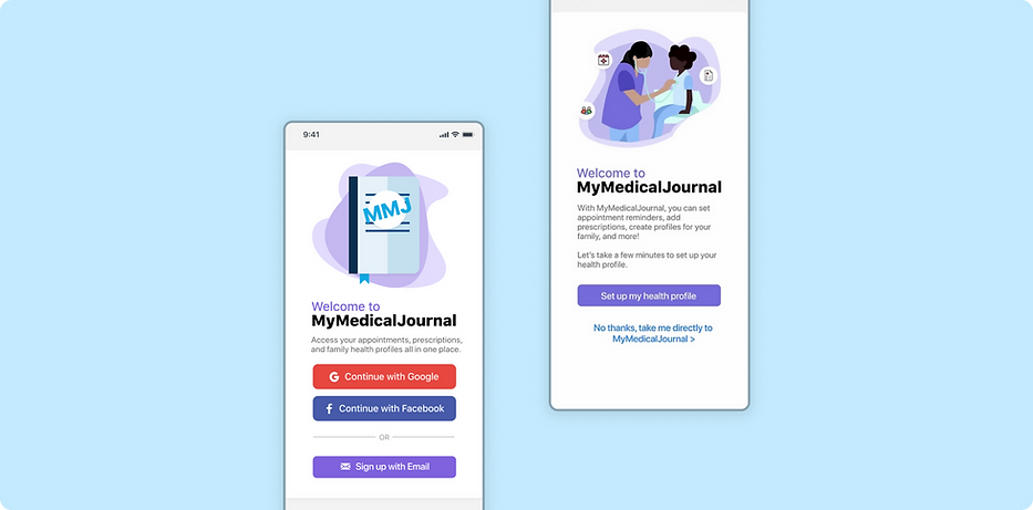
Onboarding: Once the user launches MyMedicalJournal, they will be taken to a login screen. If the user has not created an account yet, they can register as a new user to go through the onboarding process.
The user will create a new username and password and then be asked to provide their health team (doctors), prescriptions, and family profiles, if they wish. After completing the quick onboarding process, they will be taken to the home screen.


Appointments: If the user selects the Appointments tab on the bottom menu, they are able to check their current appointments on the month using a calendar. There will also be upcoming appointments listed underneath the calendar for easy viewing.
Users can also add new appointments and identify those that are recurring. They can also add the appropriate healthcare provider for each appointment.


Prescriptions: In the Prescriptions screen, users are able to add any of prescription medications that they are currently taking. The calendar view can show them the overall dosage and days of the week that they have medications to take. They can also set reminders to take medication and identify refills.


Family Profiles: The Family Profiles section of the application will allow users to manage the healthcare of their family members. They are able to create profiles for each desired family member. Each family member profile will follow the simple flow of adding prescriptions and current appointments, but the user will be able to access the same screens as the primary profile.

The Figma Prototype + Video Walkthrough

Usability Tests
We conducted four separate usability tests using our high-fidelity prototype. Some of the usability tests were conducted in-person, while others were conducted remotely.
The test I conducted is outlined below.
Usability Test 1: Conducted by Athira
Overall Impression: “I like this app. I can see myself using it in the future, since it provides an easy way to refer to all of my health information quickly.”
Onboarding:
-
Process was clear and simple
-
I like how it was one step at a time
-
Home screen: not sure what the calendar is about, are appointments supposed to show up on the calendar?
-
I like the fact that it tells me to take this medication right on the homepage
Future work for Onboarding:
-
Perhaps add messaging that the calendar will show upcoming appointments on the home screen
-
A tutorial that shows up the first time a user completes onboarding that explains the features on the home screen could be useful
Appointments:
-
I like the little icons next to each appointment
-
Creating a new appointment: clicking on healthcare provider: didn’t know to hit “back”
-
I thought creating a new appointment was overall pretty easy, it gave me a lot of options to put reminders for the appointments, which I like
-
For the recurring appointments though, how can I have both x times AND an end date? Shouldn’t it be one or the other?
Future work for Appointments:
-
Add a “confirm” button on the top right after the healthcare provider is chosen when creating a new appointment
-
Change the recurring options to choose between an end date OR number of recurrences/times
Prescriptions:
-
Why is there a calendar for prescriptions?
-
I don’t understand the colors for these different medications; why is Keflex in red, but Ibuprofen in blue?
-
It wasn’t easy/intuitive to find how to mark a prescription as taken
-
I like the “current prescriptions” page - I like how it says all of the info, like which doctor prescribed it
-
Although I feel like it would be useful to have a picture of the pill
-
Future work for Prescriptions:
-
Remove calendar from prescriptions screen
-
Perhaps distinguish between the medications in a way other than using colors; maybe with shadows/lines so that it doesn’t imply that the colors have a certain meaning
-
Find a way for users to easily check off a prescription as taken/skipped; maybe an icon or checkbox on each prescription card
-
Have the ability to upload image of the pill / maybe search for the medication in a database that already has the image
Family profiles:
-
I liked the family profiles screens because they were similar to the process I went through in onboarding
-
So this reminded me of that, making it easy to understand
-
Future work for Family profiles:
-
N/A